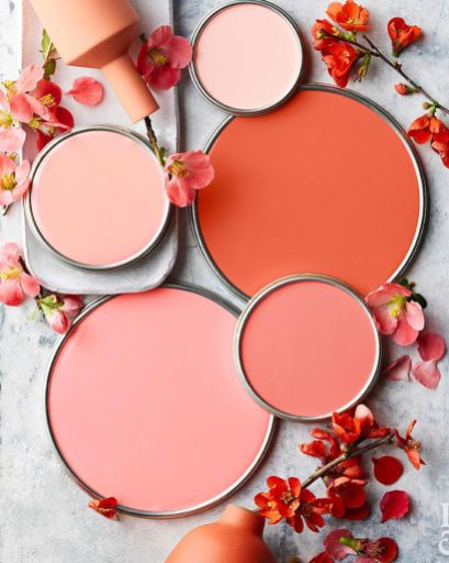
Feature image via: Honeycombers
by Marica Fick
Like previous years, I was once again surprised by Pantone’s selection for Colour of the Year 2019. My first reaction (and Rose’s too for that matter) upon hearing “The Chosen” colour for this year was: “Coral, really?! – been there done that!” That is so 8 years ago. In fact, we have actually mentioned coral in not one, but TWO blog posts in the past – both trend reflection articles – in 2011 and 2012.
Don’t get me wrong – it is not that I don’t like coral – I actually like it quite a bit and I was once again reminded of that fact while searching for all the gorgeous inspiration pictures we have shared below.
In Pantone’s defence – the way we use coral (now versus 8 years ago), how it is applied in an interior space and the colours we combine it with has evolved into something more “here and now”. Trends tend to do that – evolve.

I tried to recollect whether we at Design Monarchy have ever had interior projects that strongly featured coral. I immediately thought of one hospitality / retirement project we were involved with that included coral into the colour scheme. It was an upmarket seaside venue and we paired the coral with tones of blue – teal and aqua. See the fabric scheme: HERE.
On further reflection, I found that we had a few design and decorating projects that incorporated some shade of coral as an accent colour – be that a coral-coloured scatter cushion or a floral fabric featuring a lovely blue and coral bloom.
Here is what Pantone had to say about their colour choice for 2019, I have extracted a few (lofty, eye-roll) key phrases:
 Living Coral is…
“An animating and life-affirming coral hue with a golden undertone that energizes and enlivens with a softer edge.”
“Vibrant, yet mellow Living Coral embraces us with warmth and nourishment to provide comfort and buoyancy in our continually shifting environment.”
“Sociable and spirited, the engaging nature of Living Coral welcomes and encourages lighthearted activity. Symbolizing our innate need for optimism and joyful pursuits, it embodies our desire for playful expression.”
“Living Coral emits the desired, familiar, and energizing aspects of colour found in nature. Lying at the centre of our naturally vivid and chromatic ecosystem, it is evocative of how coral reefs provide shelter to a diverse kaleidoscope of colour.”
How to use Living Coral:
Pantone also put together 5 colour schemes each incorporating Living Coral. These palettes are a lovely collection of colours that illustrates how you can compliment and harmonize Living Coral with other colours in your home or interior. My favourite scheme would have to be “Shimmering Sunset” – a “bold and brilliant” palette of sunrises and sunsets – pinks, yellows and purples. You can view these palettes on the Pantone website: HERE.
We already know from trends past that coral pairs beautifully with mint or aqua. Mint is fresh and cool, coral is warm and lively – this is what makes this colour pairing so perfect. It reminds me of a cool spring day! It is a fresh and bright combination that would work perfectly in a Coastal-style home.
Another winning combination is that of coral and a deep midnight blue or navy. It is so bold and dramatic! Then, of course, there is the contemporary colour palette that features a blend of corals, pinks and other flesh-toned colours. Throw some yellow into the mix and I am in love!
For those who find the idea of decorating their home or space with a bold colour like Living Coral daunting – don’t sweat. Use coral as an accent colour – a couple of scatter cushions and a few decorative accessories is more than enough. As the Afrikaans-speaking folk would say, “moet nou nie die dam onder die eend se gat uitruk nie!” (type that one into Google Translate, I dare you! *tears of laughter*). In short, it means there is no need to go overboard. You don’t have to redecorate your whole home in tones of Living Coral.
And, of course, we can’t sign off without showing you those Living Coral-inspired interiors images I mentioned earlier!
So what do you think of the Colour of the Year? Yay or Nay?


[…] Quartz & Serenity, the last ten years have been pretty bold and punchy. Think last year’s Living Coral, 2018’s Ultra Violet, and 2013’s […]