Do you swap out your home’s decorative accessories seasonally?

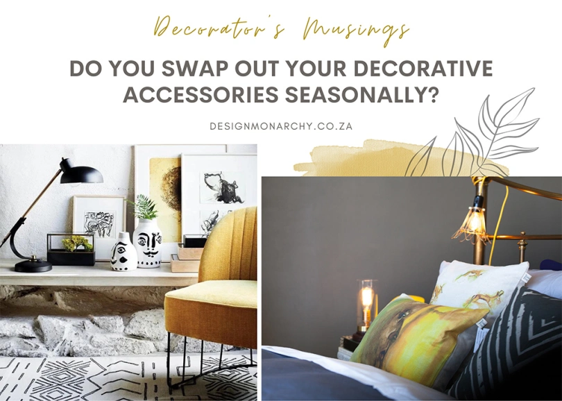
feature image: pezula interiors & design monarchy

by Rose McClement

Marica recently posed an interesting question to our social media audience. Before publishing the post, we had a brief chat about it. Like we generally tend to do.

The question was “Do you swap out your home’s decorative accessories or scatters seasonally?” I didn’t really give it much thought at the time, because I knew my own answer as being “NO, I don’t“.

I knew that I wasn’t even in the slightest bit inclined towards such a move. I have a friend who does that, but then she is a seamstress and likes to sew new covers for her cushions and other little things.

Me, on the other, I’m no seamstress and have always had a bad relationship with a sewing machine.

A punchy and lush collection of decorative accessories and scatters. | source: Decoholic

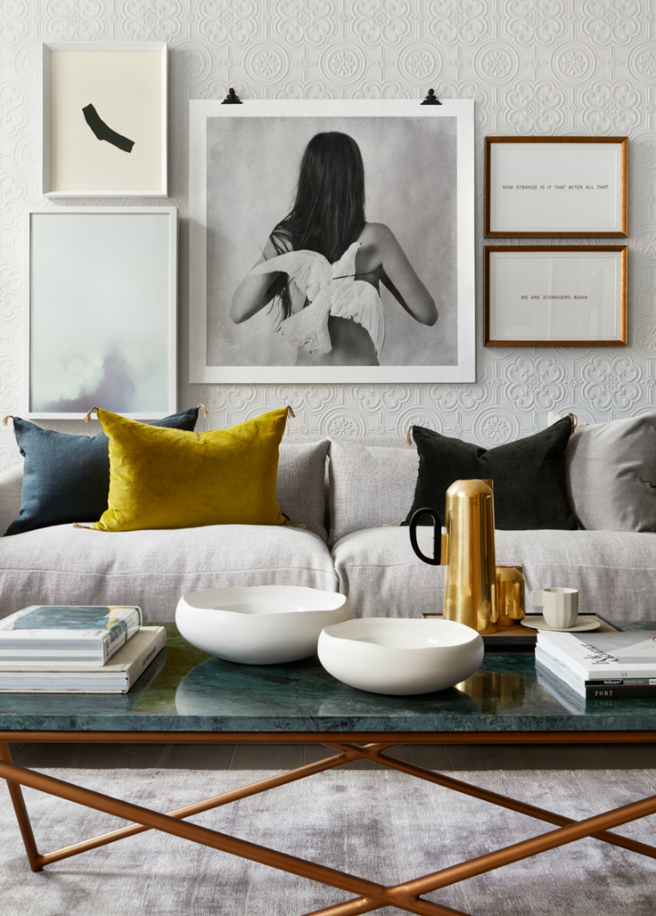
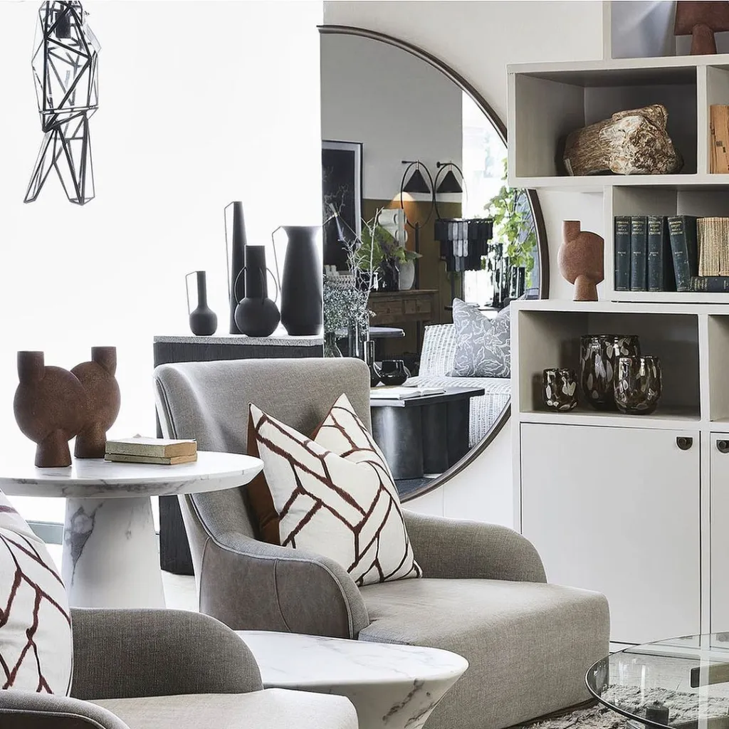
It was only when the answers from my friends started rolling in, that I stopped to notice my own resistance to something like this. Yes – what I had put down as my own lack of interest, was actually resistance. I saw others offering one or two of my own type of “Nah, why should I?” kinda comments. Others said, “I don’t have the storage space“- a fair response. Yet, when I stop and scratch a little bit further, that answer falls by the wayside. Scatter cushion covers can be stored in your linen cupboard, along with your other linen goodies – one would not need a lot of space.

A few of my friends had taken the time to comment, and I’d say the majority voiced the same reply: “I keep it the same all the time“. In other words, day in and day out, week in and week out, month in and month out, year in and year out – I keep the same décor accessories in place. Kinda like X marks the spot for X. 

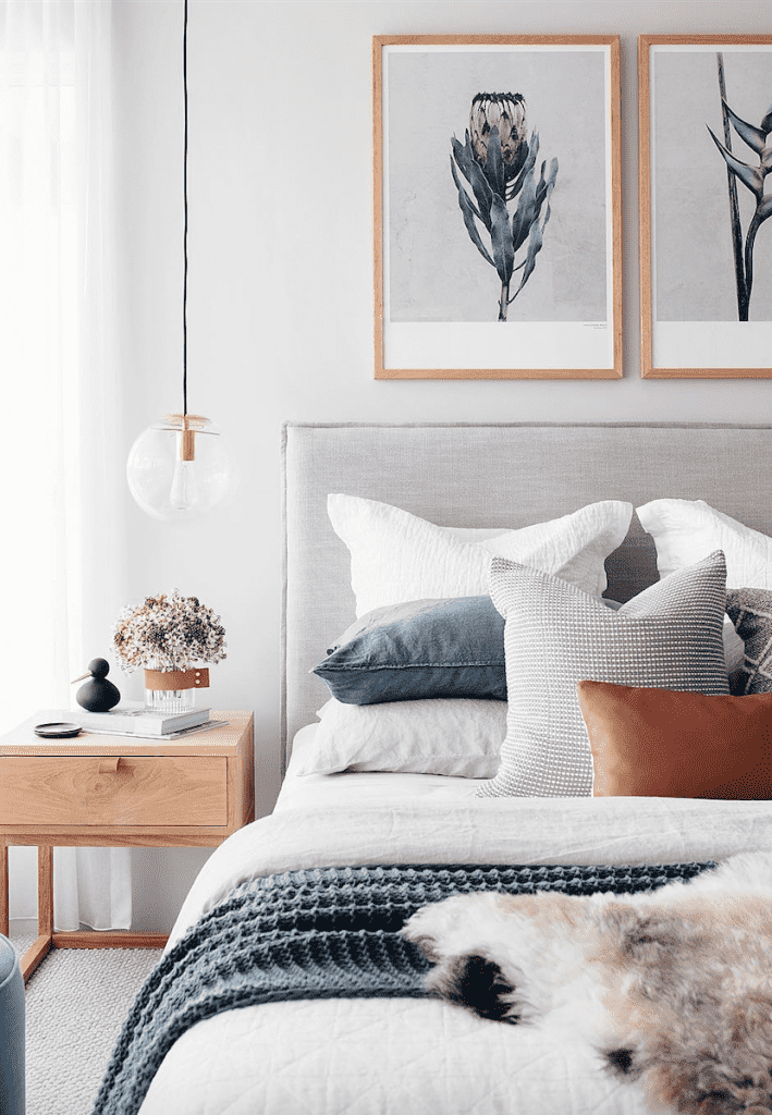
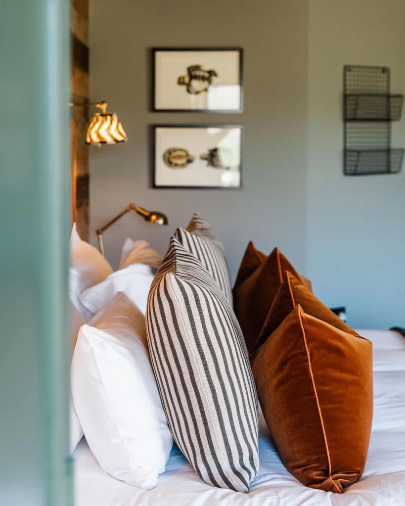
Whoa, hold up here!! I am not judging them and their way of being in their home. Not at all – I am doing the same thing remember. The only difference is that I like moving my (same) decorative accessories around the space. I tend to move the cushions from one sofa to the other and shuffle the decorative items around a bit. But – that is about it! No seasonal cover changes for me.

A beautiful and calming selection of scatter cushions and decorative items – perfect for the colder months. | source: Halfway Wholeistic

Okay, you might be asking yourself: “So what is this decorator banging on about?!” Why is this even worth writing about? Is there really any value or benefit in switching up your décor accessories occasionally? The truth is, that despite the fact that I don’t indulge in this practice, it doesn’t minimize the value and appreciation of it. There is real value to be had. Not only from a practical point of view but also aesthetically, emotionally, and mentally! Really?! From scatter cushions?

Do I really have to be satisfied with the same ole same ole all year round I asked myself? Then the ‘dig deeper’ type questions started to rise to the surface. Once I began to see and own my reluctance, I had a shift in thinking. 

With a neutral backdrop, it would be easy-peasy to swap out the scatters and bed throw in your bedroom should you desire a change of scenery. | source: oh.eight.oh.nine

So, let’s do a bit of self-exploration together. Just easy-does-it self-exploration, done with a hint of playful curiosity. Ask yourself the following without being self “judgie” or self-justifying: 

What is really holding me back?  Is it something I want to do or even need to do?

Do I like what I have here? Does it make me feel good in this space? Or would something new and fresh make me feel even better?

Am I putting up with what I have got going here?

What have I got to loose by not switching up accessories?

With a layered approach like in this image, it would be quite simple and effective to change the tone of your bedroom. Exchange the beautiful rust-coloured cushions for teal or swap the striped cushions for floral – et voila. | source: Jojo Barr | House Nine Design

Now, which one or more responses in the list below do you connect with? Remember – not self judgy-ness!

I like what I have got going right now. It took me a while to get the right accessories and I don’t feel the need for change.

Trends come and go so quickly. No need to follow those.

My spending plan can’t cope with this extra unnecessary expense.

I have no storage facility.

I don’t know what to do, what to switch up, or even where to begin!

It’s going to take time and energy to decide on the items and change – and I don’t have that to give.

It is what it is!

My husband / family like what there is now. 

Why bother – the family just mess it up anyway.

I prefer the comfort of familiar items.

It just takes one or two key changes to completely transform the feel of your interior. Warm or cool, playful or opulent, sleek minimalistic or vintage – it just takes one quick swap. | source: La Grange Interiors

I have to wonder what are the chances that in truth we need to own the fact that the only thing that we are resisting might well be CHANGE!

Ah – there it is!! There is the real culprit that is lurking in the shadows, not wanting to be seen or heard. That word that shall not be spoken! CHANGE!!  

You might say: “Oh, for Pete’s sake, don’t be silly! How on earth can one view being uninclined towards switching up décor accessories as an indication of resisting CHANGE?!” Well, the possibility could exist! I certainly wouldn’t discount it. In our line of work, we often encounter resistance along these lines – in all shapes and forms.

We are only all too aware of the fact that life is very full and busy for most folk. The last thing anyone needs is to direct their attention to small changes. Even easy peasy changes are unwelcome.

What is important for me is this: small changes are needed to power us towards the bigger changes. It gets us outta our comfort zone and willing to entertain change on a regular basis.

Sadly, in my own life, I observed that because I resist change, I begin to “put up” with dissatisfying situations. It all stays the same. REALLY! Is that what I want?  I don’t think so. It seems that the question really is much bigger than merely switching up decorative items.

Enough said for now. Lots to think about and explore. More along these lines in the next post.

Ciao,

7 Home Decorating Regrets

7 Home Decorating Items & Decisions We Regret

by Marica Fick & Rose McClement

Earlier this week I read an article on Apartment Therapy that set the hamster wheel in my head spinning. The title grabbed me immediately: “3 Common Home Items I Wish I Never Bought”. In the post freelance writer, Sarah Lyon, shared that her past home decorating efforts has been accompanied by a fair dose of regret.

Sarah goes on to explain that while some treasured purchases have found a permanent place in her home, others left her with a bad taste in the mouth after a few short months. Her regrets include: cheesy, cliched wall art, cheap wine glasses, and pieces that are “too nice”.

While we did not entirely agree with all of her laments, it did spark an interesting office conversation. So here is Design Monarchy‘s list of home decorating items and decisions we regret…

Beautiful Vinyl Floor
We would opt for a beautiful good-quality vinyl floor above carpet in a heartbeat. | source: Godfrey Hirst via Instagram

Wall-to-Wall Carpet:

The first item on our home decorating regret list is one both Rose and I can’t wait to say “goodbye and good riddance” to. Wall-to-wall carpets. Until recently, opting for carpets throughout the home has been such an ingrain and default choice in home decorating.

We found that carpets take such an effort to clean and maintain in the long run. It just does not have the physical and aesthetic longevity that some other floor finishes have. No matter how regularly you vacuum and deep-clean your carpet, it still becomes a dirt and odour trap – especially if you have pets or little kiddos.

The carpets in my home are a real eye-sore. It was gorgeous when first installed but now it looks grubby no matter what we do. We have had it cleaned SO many times with no real improvement. And these were good quality, high traffic carpets!

Now, don’t get us wrong – we are not saying that you should immediately rip up the carpets in your home and get rid of them. We understand that there are some situations and areas where it remains the preferred application. Especially a bedroom – most people still prefer the added warmth and soft feel underfoot that carpets provide.

When it comes to general areas and living rooms we often recommend a good quality vinyl to our clients as an alternative floor covering. It is much easier to clean and maintain and adds a lovely visual warmth to any space. You can always opt for a loose rug that can be washed or changed as desired.

Read More »

Kirsten Goss Abode Homeware

Currently Coveting: Kirsten Goss ABODE

by Marica Fick

I’ve gone and done it again… lost my heart.

I know, not too long ago I was pledging my undying love to something completely different. At that moment I was head-over heels and coveting the funky, contemporary, African-chic ZCafe Rope Chair designed by Egg Designs (and it is still gorgeous by the way).

What can I say, my heart is a bit fickle – but luckily – I have a BIG heart so there is room for far more beautiful things. I’m a sucker for a bit of local eye-candy.

What, you my ask, has got me drooling this time around? I’m currently coveting the beautifully chic ABODE collection by South African jewellery designer, Kirsten Goss. This elegant homeware addition to Kirsten’s established jewellery brand is both refreshing and unexpected.

Kirsten who opened her flagship jewellery store in London in 2005, has designed pieces for Kate Middleton and Prince William’s royal wedding and her jewellery designs have been worn by several A-list celebrities.

Kirsten’s “Lily Pad Ring” won the Most Beautiful Object in South Africa (MBOISA) at the Design Indaba Expo 2012. The ring’s contemporary design, intriguing organic lines and playful edge exemplifies Kirsten’s award-winning style aesthetic.

Read More »

Pantone Colour of the Year: Classic Blue | via thedesigntabloid.com

Pantone Colour of 2020: CLASSIC BLUE

Feature image via: Design Monarchy Interior Design Studio

by Marica Fick

Happy 2020 folks! 2020… can you believe?! It sounds very sci-fi. I hope you all had a lovely, rest-filled festive break and are all geared for the new year?

I’m sure by now you have all noticed a certain colour trend flooding your Pinterest, Instagram and blog feeds? You know the colour I’m referring to – it is a bold, almost primary blue… a kind of “delft-meets-school-uniform”.  Well, however you choose to describe it, it is called CLASSIC BLUE and it is Pantone’s Colour of the Year 2020.

I know I mention this every year, but I was once again surprised by Pantone’s selection for Colour of the Year – it is never what I expect it to be. Not that I am going to complain because I just so happen to be a blue-girl. While Classic Blue is a tiny bit on the strong and bright side for me, I generally love all shades and hues of blue.

Thinking back on Pantone’s previous selections for COTY, it does seem that they prefer bold and bright above muted and soft. With the exclusion of 2015’s dusky Marsala and 2016’s soft pastel duo, Rose Quartz & Serenity, the last ten years have been pretty bold and punchy. Think last year’s Living Coral, 2018’s Ultra Violet, and 2013’s Emerald.

Pantone Colour of the Year: Classic Blue | via thedesigntabloid.com
The Classic Blue painted wall of this living room combined with the gorgeous green velvet Chesterfield sofa, quirky art pieces and crisp white painted mouldings and floor make for a dynamic and fresh interior. | source: Anthropologie

The selection of Classic Blue as Pantone’s Colour of the Year also came as a surprise to a good few trend-watchers and forecasters who anticipated a shade of green to win out. Plascon, for example, reflected this in their choice for Hue of 2020, Mulberry Leaf, a gorgeous moody green.

Some trend observers are of the opinion that Pantone was playing it rather “safe” by selecting a generally liked colour like blue.

In an article written for Dezeen, design consultant Michelle Ogundehin stated that in choosing a democratic colour like blue, Pantone played it safe and still missed the mark:

“… seeing as blue is routinely cited as one of the Western world’s eternally favourite colours – no doubt because it instantly recalls cloudless summer skies and warm calm seas – it couldn’t go wrong with such an inoffensive pick. Or could it?

Michelle went on to say that this rather safe choice is a result of the backlash and criticism surrounding last year’s COTY, Living Coral. Design commentators and critics felt the inspiration behind the colour and name selection was an insensitive choice considering the rapidly dwindling amount of coral left in our oceans.

Read More »

Instagram Inspiration | November 2019

Instagram Inspiration: November

feature image: Niki Brantmark of My Scandinavian Home via Instagram

by Marica Fick

Most mornings, while enjoying our first cup of coffee and checking our emails, we also take some time to browse through Pinterest and Instagram. It is part of our studio routine and, I would say, one of the key perks off being in the interior design and decorating trade. Seriously, we get paid to look at beautiful images – let’s just call it “Research & Development” shall we.

Every week we spot these amazing, inspirational, drop-dead gorgeous and down-right desirable images on Instagram. From beautiful interiors, furniture, and fabrics to lovely eateries and spaces, delicious-looking food and oh-so-fashionable apparel.

We would love to share this visual inspiration with you. Each month we will post a roundup of our favourite Instagram finds – anything that made us go “wow” or weak at the knees. The instant-likes that turned into #instalove.

Let’s kick off with the lovely feature image above.

This lovely wall light… (feature image above)

Blogger, Niki Brantmark of My Scandinavian Home, shared this inspirational image of a lovely little corner in her home. If you browse through her Instagram feed you will notice that this living room nook in her apartment in Sweden has changed and morphed multiple times over the years. I love the current configuration though!

The feature that first drew me was the gorgeous dove grey and brass long-arm wall light. The ever-evolving collection of framed art and prints on the gallery wall above her sofa further adds to the lovely Scandi feel.

This very chic-looking bunk bed…

Now isn’t this the most elegantly put together kids room you have ever seen? Designed by Amber Lewis of LA-based Amber Interior Design Studio, this space is all kinds of beautiful. From the sleek fitted bunk beds with wooden ladder and trim to the built-in book niches at the head of each bed. Not to mention the floating shelf storage unit at the foot of the beds and the stunning brass wall light fittings. The bright white and lovely rusty pink / coral colour scheme is so pretty to boot.

It’s clean, it’s contemporary, and it’s chic, yet playful and feminine enough for a little girl’s bedroom.Read More »

Friday Finds: ZCafe Rope Dining Chair

Currently Coveting: ZCafe Rope Dining Chair

by Marica Fick

I recently fell in love.

Who, you might ask, has captured my heart? Well, my dear readers, it is not a who but rather a WHAT. You see, I have fallen in design-love. My eyes have been a-wandering and my heart has been a-coveting.

Last month I was doing a little bit of online research and sourcing for our blog article, 10 Sleek & Chic Bar Cabinets for Your Home. The search for some locally-designed bar cabinets led me to Egg Designs where I not only found their eye-catching Parquet Cabinet (featured in our post), but also a gorgeous chair that had me crushing hard.

The ZCafe Rope Chair is a gorgeous dining chair with a funky, contemporary African-chic feel. The chair has an almost tub chair-like design with a steel frame that features a woven two-tone rope back and a brown leather seat. I found the various colour combinations especially beautiful. The copper frame with turquoise and orange nylon rope detail must be my personal favourite… although the black, burgundy and yellow combination is just as lovely.Read More »