

by Rose McClement
I know, I know – since it is very nearly the end of February, I’m a tad late with the whole writing about the Colour of the Year 2021 trends! The chances are that you are already familiar with it. Well, at least the Pantone colours for 2021, since those seem to have a greater public spread (it’s yellow and grey for those who missed it). Last week, while sharing a past interior project on Instagram and Facebook, we noticed – by happy accident – that we applied those very Pantone colours to the room we designed. Maybe that is why I am drawn to exploring all the other chosen colours for 2021.
As you know, I am a #ColourFreak – I love colour! Through all my many years of exploring it, delving deeply into its ability to transform interior spaces (as if by magic), I find I never tire of it. I might shift gears often from bright to calming colours, from that which speaks to passivity over to that which enfolds you in a surge of passion. Moods – yes, colours are moody as well. It’s a state that is not only reserved for the female gender.
Dulux Colour of The Year 2021: Brave Ground
This morning I landed on a site that highlighted the Dulux Colour of 2021 (and its colour combos) – in video format. I found myself totally relaxing into the video’s words, content, and colours. Phrases such as “a drop of Courage carries us forward”, “courage to embrace change“, “invigorating“, “self-belief” and “collective connection” – the words grabbed my attention.
I think the psychology behind Dulux’s selections is a perfect summary of what we will need for the year 2021. We need “Brave Ground”. We need to be able to give ourselves permission to throw on the Cloak of Courage. To step bravely into that place of transformation that is calling us – whatever that might look like for each one of us. I have no doubt that every person in this “Global Village” has felt the shifting vibes that this transformation evokes.
And what about the colour itself? Brave Ground, which is a beigey neutral, seems to be stirring up a bit of controversy since it is so “sombre”. A lot of people question whether we need a colour so “depressing” at this time of the COVID PANDEMIC – wouldn’t the collective mood rather do with a pick-me-up colour?
Yes, there is truth in that thinking. YET, I also appreciate what the Dulux Colour Specialists are driving at. Hold that “Brave Ground” colour within the context of their bigger picture (as illustrated in their video) – a wider colour spectrum of which Brave Ground is more like a foundation.
You know, I have a feeling that more and more we are being ushered away from the grey tones that have been forefront for many years – towards the many tones of brown. Maybe, towards a more grounded context for life? Just think about it – how many of us would have entertained the thought of darker grey feature walls in our homes, gunmetal grey kitchen cabinets, etc. a decade ago? Now it is so every day, that even in the ‘burbs there are houses the exterior of which are painted deep, dark grey. Who would have thunk?
Quite frankly, I’m interested to see how the brown colour palette will gain momentum to become the “go-to” interior colour choice, so to speak! Let’s watch this space to see whether my hunch is valid.
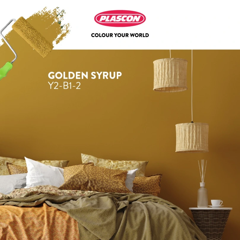
Plascon Favourite Hue of 2021: Golden Syrup
Well, for those who feel that Dulux missed the mark and that Brave Ground is anathema, Plascon has that pick-me-up colour for you! They have selected the bright and bold colour “Golden Syrup” as their “Favourite Hue of 2021“. Opposite of Dulux’s grounding colour, they have reached for the sun’s effects on us. What does the word and concept of Golden Syrup evoke within you? For me, I think of honeycomb and delicious desserts! Oh – and – childhood pantry raids! Yum!
To quote them (because they have said it so well and why reinvent the wheel):
“Plascon’s Favourite Hue of 2021 invites us to shake off the heaviness of the year gone by and dare to imagine a lighter, brighter future.”
“Let your optimism take over and use Golden Syrup to transform your interiors from hiding places to creative spaces. Better yet fully embrace the audacity of hope and let it reflect boldly on your exteriors too.”
How do you like the sound of “embrace the audacity of Hope”. Wow! I like this.
So, as I see it, these two colours balance each other. Put them on the scales and you have balance. You have the firm foundation of “Brave Ground” for stabilizing transformation while embracing the sweet and yummy glow of hope in “Golden Syrup”!
Thank you. I’ll take that.
I’d be interested to know which of these two colours intuitively grab your attention and why! Anyone???
Ciao for now wonderful Readers.


")
")


